This blog is excellent. You have a creative flair that make your photos interesting creative and lively. There are times when I prefer your photos to the professional examples!
Mr Rees
Friday, 24 May 2013
Laura Hennesey
I like these photos because their are very effective the themes of dance and beauty are very well executed.
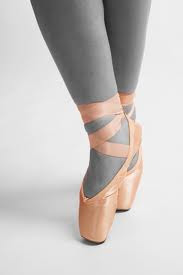
Ballet theme-compared images
My images
 This is the professional image.

This is an example of the image I copied, but, i decided to change the image a bit to improve it, by taking it at a slightly different angle to what the professional one was. To edit the picture, i changed the points to be brighter and the background black and white, because the professional one has black and white legs and coloured points.


This is an example of the image I copied, but, i decided to change the image a bit to improve it, by taking it at a slightly different angle to what the professional one was. To edit the picture, i changed the points to be brighter and the background black and white, because the professional one has black and white legs and coloured points.
Reconstuction theme- my images
My images-comparison


This is the picture I copied.
I copied the above picture because I think that it is interesting, and easy to portray. to copy this picture, i took the idea but made it a wider angle because i think that the above one was too close. I did no editing to this picture because I think it is displayed in the picture.
Friday, 10 May 2013
My images-Reconstruction theme
My images

This is the original picture.

To edit this picture, i changed the vibrancy and saturation. I did this because it brought out the colours and made the image more interesting for the viewer. I feel that this picture only slightly relates to my topic because the signs seem old, which suggests they need renewing. The angle i took this at was straight on because these are the main focus to the image.
My images-Reconstruction theme
My images

This is the original picture.

To edit this picture, I increased both the brightness and the contrast. I did this so the image became more interesting, as i feel that before the image was slightly too dark and less appealing. I think that this image relates to by theme well as it is broken and rundown.
My images-Reconstruction theme
My images

This is my original picture.

To edit this picture, I brought out the blue and red because I thought that these were the most prominent colours. I think that this picture is effective because although it has changed to be brighter, it still looks rundown and broken.

This is my original picture.

To edit this picture, I brought out the blue and red because I thought that these were the most prominent colours. I think that this picture is effective because although it has changed to be brighter, it still looks rundown and broken.
My images-Reconstruction theme
My images

This is the original picture.

On his picture I added a filter to maximize the appearance of it, i chose to use the filter 'dry brush' and customised the options to the pictures advantage e.g brush size, brush detail and texture. I think that the filter makes a difference, to its advantage because it brings out the details in the image. I also think this represents my theme because the building is burnt, and the windows are covered up so it makes it seem to need reconstruction.
My images-Reconstruction theme
My images


This is my original picture.
This picture I feel is particularly effective because is at a lower angle, it shows the group of houses over a rural area makes it seem longer. To edit this picture, I dimmed the brightness and made the sky darker so it looked like it needed reconstruction. I think that having the picture over a rural piece of land makes it seem in a need of reconstruction and also makes it longer.
Wednesday, 8 May 2013
My images-Reconstruction theme
My Images

This is the original picture.

To edit this picture, I increased the vibrancy but at the same time decreased the saturation. I did this because, it made the colour brighter but also made it not to overpowering. So i decided to keep the colour slightly brighter than the original picture. I think this picture represents my theme well because of the boarded up door and window.
My images-Reconstruction theme
My images

This is the original picture.

This picture, I wanted to be black and white because I found that it made the image seem more abandoned. I think that because I took the picture at eye level to the fence, but looking up at the building made the building seem bigger than it is in reality. I think that this picture represents the theme well because it shows the run down and broken building.
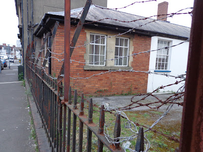
My images-Reconstruction theme
My images

This is the original picture.

This picture I feel represents the rule of thirds well, as the main focus points of the picture are the windows as they are covered up and show a rural theme. I think that because the windows all go along the rule of thirds line it makes them more of a focus point to the image. I also think that this picture represents the idea of symmetry.


From this picture, I cropped out two parts that improve the idea and theme of the picture they are both graffiti to the building and particularly make the image look older and more rundown.
My images-Reconstruction theme
My images

This is the original picture.
For this picture, I feel that the angle particularly benefits the image. I think that when I took the picture, because I had the fence starting at the horizon of the picture it made it more interesting to look at, but also made the image look longer and have a lengthened look to it. To edit this picture, I decided to make it 'dimmer' and take a lot of the colour out of it, I did this because I wanted the picture to look run down.
Friday, 3 May 2013
My images-Reconstruction theme
My Images

This was the original picture;

I took this picture to represent the need of reconstruction to the place, around the picture is a range of cracks and broken bits in and around the picture. To edit the picture I changed the brightness and contrast this made the features of the building become more prominent. Also the words 'opening delayed due to credit crunch' is now brighter, so it becomes more of a focus point to the picture.
Subscribe to:
Comments (Atom)