This blog is excellent. You have a creative flair that make your photos interesting creative and lively. There are times when I prefer your photos to the professional examples!
Mr Rees
Friday, 24 May 2013
Laura Hennesey
I like these photos because their are very effective the themes of dance and beauty are very well executed.
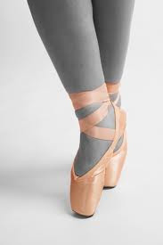
Ballet theme-compared images
My images
 This is the professional image.

This is an example of the image I copied, but, i decided to change the image a bit to improve it, by taking it at a slightly different angle to what the professional one was. To edit the picture, i changed the points to be brighter and the background black and white, because the professional one has black and white legs and coloured points.


This is an example of the image I copied, but, i decided to change the image a bit to improve it, by taking it at a slightly different angle to what the professional one was. To edit the picture, i changed the points to be brighter and the background black and white, because the professional one has black and white legs and coloured points.
Reconstuction theme- my images
My images-comparison


This is the picture I copied.
I copied the above picture because I think that it is interesting, and easy to portray. to copy this picture, i took the idea but made it a wider angle because i think that the above one was too close. I did no editing to this picture because I think it is displayed in the picture.
Friday, 10 May 2013
My images-Reconstruction theme
My images

This is the original picture.

To edit this picture, i changed the vibrancy and saturation. I did this because it brought out the colours and made the image more interesting for the viewer. I feel that this picture only slightly relates to my topic because the signs seem old, which suggests they need renewing. The angle i took this at was straight on because these are the main focus to the image.
My images-Reconstruction theme
My images

This is the original picture.

To edit this picture, I increased both the brightness and the contrast. I did this so the image became more interesting, as i feel that before the image was slightly too dark and less appealing. I think that this image relates to by theme well as it is broken and rundown.
My images-Reconstruction theme
My images

This is my original picture.

To edit this picture, I brought out the blue and red because I thought that these were the most prominent colours. I think that this picture is effective because although it has changed to be brighter, it still looks rundown and broken.

This is my original picture.

To edit this picture, I brought out the blue and red because I thought that these were the most prominent colours. I think that this picture is effective because although it has changed to be brighter, it still looks rundown and broken.
My images-Reconstruction theme
My images

This is the original picture.

On his picture I added a filter to maximize the appearance of it, i chose to use the filter 'dry brush' and customised the options to the pictures advantage e.g brush size, brush detail and texture. I think that the filter makes a difference, to its advantage because it brings out the details in the image. I also think this represents my theme because the building is burnt, and the windows are covered up so it makes it seem to need reconstruction.
My images-Reconstruction theme
My images


This is my original picture.
This picture I feel is particularly effective because is at a lower angle, it shows the group of houses over a rural area makes it seem longer. To edit this picture, I dimmed the brightness and made the sky darker so it looked like it needed reconstruction. I think that having the picture over a rural piece of land makes it seem in a need of reconstruction and also makes it longer.
Wednesday, 8 May 2013
My images-Reconstruction theme
My Images

This is the original picture.

To edit this picture, I increased the vibrancy but at the same time decreased the saturation. I did this because, it made the colour brighter but also made it not to overpowering. So i decided to keep the colour slightly brighter than the original picture. I think this picture represents my theme well because of the boarded up door and window.
My images-Reconstruction theme
My images

This is the original picture.

This picture, I wanted to be black and white because I found that it made the image seem more abandoned. I think that because I took the picture at eye level to the fence, but looking up at the building made the building seem bigger than it is in reality. I think that this picture represents the theme well because it shows the run down and broken building.
My images-Reconstruction theme
My images

This is the original picture.

This picture I feel represents the rule of thirds well, as the main focus points of the picture are the windows as they are covered up and show a rural theme. I think that because the windows all go along the rule of thirds line it makes them more of a focus point to the image. I also think that this picture represents the idea of symmetry.


From this picture, I cropped out two parts that improve the idea and theme of the picture they are both graffiti to the building and particularly make the image look older and more rundown.
My images-Reconstruction theme
My images
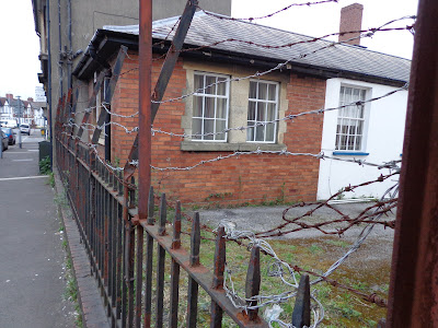

This is the original picture.
For this picture, I feel that the angle particularly benefits the image. I think that when I took the picture, because I had the fence starting at the horizon of the picture it made it more interesting to look at, but also made the image look longer and have a lengthened look to it. To edit this picture, I decided to make it 'dimmer' and take a lot of the colour out of it, I did this because I wanted the picture to look run down.
Friday, 3 May 2013
My images-Reconstruction theme
My Images

This was the original picture;

I took this picture to represent the need of reconstruction to the place, around the picture is a range of cracks and broken bits in and around the picture. To edit the picture I changed the brightness and contrast this made the features of the building become more prominent. Also the words 'opening delayed due to credit crunch' is now brighter, so it becomes more of a focus point to the picture.
Friday, 26 April 2013
My Images - Ballet Images
My Images
This is my original picture.

This picture, i like because she is not looking at the camera, but it is still interesting for the viewer to see. To edit this picture, I decided to keep the shadows in each corner of the image, but from there I made it slightly pink so it could have more of an interest to it. I liked the fact the dancer is holding one leg so both ballet shoes can be seen. This relates back to my theme well.
My Images- Ballet Theme
My Images

This is the original picture.

This picture represents the theme of ballet because I think that it shows the tutu at the back. I think that this is a good picture because it shows the idea of symmetry, this makes the picture nicer to look at and almost seem calmer. To edit this, i did minor editing. All i did was enhance the brightness and contrast. I think that this a good picture overall and represents the theme well.
Wednesday, 24 April 2013
My Images-Ballet theme
My Images

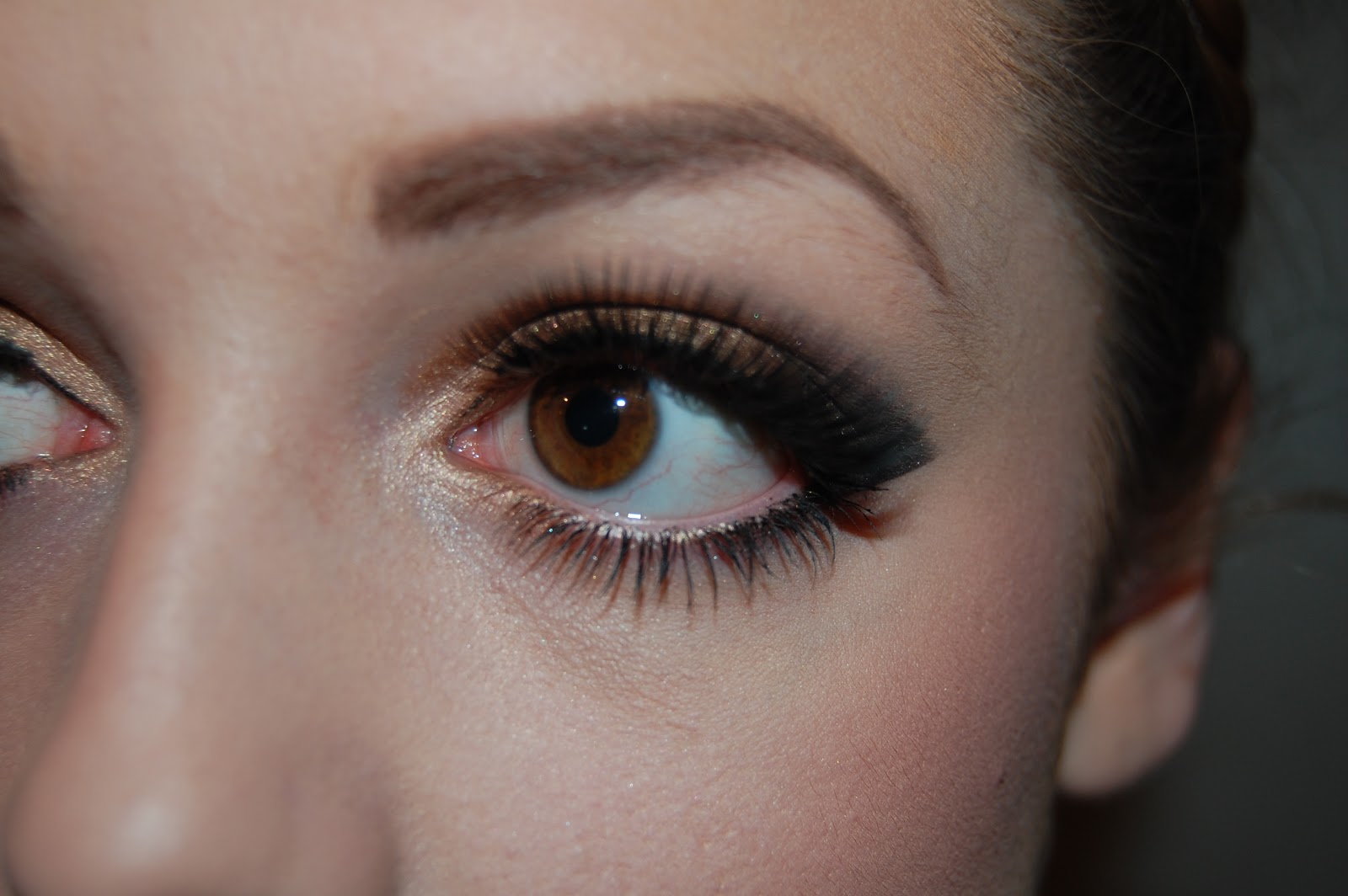
This is the original picture.


This is the first filter.
This is the first filter I added to the picture, the first time I decided it was too dark so i then increased the brightness and saw the effect that this had on the filter. After looking at the picture, I felt that the filter was too harsh and did not bring out the good side to the image. I think it made the wrong impression onto the image.


This is the original picture.


This is the first filter.
This is when I had made the first filter brighter.
This is the first filter I added to the picture, the first time I decided it was too dark so i then increased the brightness and saw the effect that this had on the filter. After looking at the picture, I felt that the filter was too harsh and did not bring out the good side to the image. I think it made the wrong impression onto the image.

I then added this filter, it called 'artist brush' and I used this because although its a subtle change it still makes the image slightly darker and makes it seem as if the tutu is darker than it is, this makes the tutu stand out in the photo.
I took this picture because I felt that because she is looking straight into the camera, it makes it more personal and seems as if she is looking straight into the camera. Also, because she is on pointe and wearing a tutu it portrays the theme of ballet.
Monday, 15 April 2013
Using a filter- Ballet Theme
Using a filter

This is the image, without a filter.

For this picture, I felt that without a filter it was less interesting. I used the filter 'accented edges' as I saw that having an outline on the picture created a better look to it. I think that it makes the picture almost seem as if it has been placed onto the background. I think that having an outline on the main focus (the person) makes a better, more interesting effect to the image. I think that this effect makes the colours of the shoes and tights stick out and adds a shine to the shoes, this makes them look better. I think that this picture is nice for the viewer to see and also more interesting.
My Images- Ballet Theme
My Images

This is the image, before I decided to edit it.

When I was looking at this picture, I thought that the shoes in the photo needed to stick out more as in the first photo the colours were only slightly different so the shoes were showing but i found that they needed to be brighter or more noticeable. To do this I cut the background out and made it black and white so not only did the shoes stick out more, the picture also portrayed a different theme. It made the picture seem as if it was taken more professionally or in a more professional place. I think that this benefits the picture. I then cut the shoes out and made these brighter so the colours stuck out more. I also think that having this picture very simple makes it calmer for the eye and a nicer photo to look at.
Saturday, 13 April 2013
My Images- Ballet Theme
My Images

This is the image, prior to editing.


This is the image, prior to editing.

This is the image once I have edited it. When I was editing this picture, I made it black and white. I did this because i felt that it brought out the main elements of the picture. It brings out the tutu, making it a darker, more defined colour. Also, i think that it brings out the models face. I also made the image brighter when I was editing because once it was turned black and white, I found that it was too dark. When I was taking the picture, I made sure that the model was looking straight into the camera, because I feel that it makes it more personal. I think this image is good because it relates back to my theme well.
Friday, 12 April 2013
My images- Ballet Theme
My Images


Before Editing.
After Editing.
To edit this image, I enhanced the contrast to make the colours in the image show up more. Also I made the brightness increase to again, magnify the colours and make the image more interesting. I feel that this image is interesting as the dancer is in a not so typical pose, so it enables the viewer to think more into the image. The idea that the dancer is not looking at the camera or on pointe suggests she may be warming up for a dance show or exam. This is good beccause it shows a range of sides to Ballet.
Ballet Theme

This picture I feel didn't need any editing because I think that if the image was over edited it would not look as effective. I chose to use this image because I felt that it conveyed the theme of Ballet correctly. I think that this picture is what is thought as a 'typical' ballet pose, so I think that including it in my Ballet theme has made my theme more around the topic of Ballet. I purposely cut out the arm because I felt that is i did include the arm into the picture, the picture may have been too long.
Monday, 18 March 2013
Images-Glamour Theme
My Images

This image, is one of my favorite's because i feel that it brings what i wanted to create together. I think that because the model is looking right into the camera it makes it more personal and creates the thought that the person is looking at you, and making eye contact with you. To edit this picture I changed the contrast of images to make the contour's of the face lighter and the eyes darker, i feel that this image successfully shows the theme of glamour.

This image, is one of my favorite's because i feel that it brings what i wanted to create together. I think that because the model is looking right into the camera it makes it more personal and creates the thought that the person is looking at you, and making eye contact with you. To edit this picture I changed the contrast of images to make the contour's of the face lighter and the eyes darker, i feel that this image successfully shows the theme of glamour.
Images-Glamour Theme
My Images

I think that this image is good and effective because it shows the makeup in the picture and makes it look glamorous. I only did a slight amount of editing to this image to just improve the brightness, this made it clearer and easier to make out certain parts of the image. I like this image because i think that the colours in it show out, but also it portrays the theme of glamour well.

I think that this image is good and effective because it shows the makeup in the picture and makes it look glamorous. I only did a slight amount of editing to this image to just improve the brightness, this made it clearer and easier to make out certain parts of the image. I like this image because i think that the colours in it show out, but also it portrays the theme of glamour well.
Images-Glamour Theme
My Images

This picture, I wanted it to seem as if she was looking into the heart, not concentrating on the camera, which i feel that this image achieves. When i was editing this picture, I changed the hue and saturation, i also changed the brightness and contrast, i changed these because i felt that it made the image a lot more interesting. I wanted the image to show the theme of glamour in a different way and I feel this image shows that.

This picture, I wanted it to seem as if she was looking into the heart, not concentrating on the camera, which i feel that this image achieves. When i was editing this picture, I changed the hue and saturation, i also changed the brightness and contrast, i changed these because i felt that it made the image a lot more interesting. I wanted the image to show the theme of glamour in a different way and I feel this image shows that.
Images-Glamour Theme
My Images

Above, is the picture before it was edited:

To edit this picture, I changed the brightness and the contrast to enhance the image's appearance. I also used the spot healing tool to make it clearer. When I changed the image's brightness and contrast I found it made the image a lot more interesting and nicer to look at. I think that although you cant see the persons eyes or any other features excluding the mouth and bottom of nose it portrays a good theme, that because the image is so simple it is nice to the eye, and the use of symmetry is in this picture makes it so much more interesting as it is so simple. I think this shows the theme well.
Sunday, 17 March 2013
Images-Glamour theme
My Images
This is the picture before it was edited:

This is the picture once it has been edited:
This picture, i took to show a close up of the eye makeup, and then i edited it to make it black and white, then from here i wanted to completely take out some of the colour and then once i did this, i found that it looked too dark, so i added a blue circle round the eye to define it and make it more exiting. So now, the pupil of the eye is the most interesting part. With the person not looking at the camera, it creates a different theme/look to the picture. Although my picture originally created a glamorous style, it now has aspects of being mysterious but still a form of glamour, which is good because then it gives the viewer more to think about, and to be able too look into this picture. I feel that this picture relates to glamour well and portrays a different side of glamour.
Subscribe to:
Comments (Atom)